Media Lab Blog Post 1
- laurenmorby

- Aug 27, 2020
- 1 min read

I thought this advertisement was very interesting to look at and I feel it did a good job of grabbing attention. The creators of this used the principle of contrast to make the tomatoes pop out. This use of contrast really draws attention to the fact that the bottle is made of out tomato slices. The illustrators of this advertisement also used emphasis because by making the ketchup bottle out of individual slices, the viewers are more likely to view Heinz ketchup as have more real tomatoes than other brands.
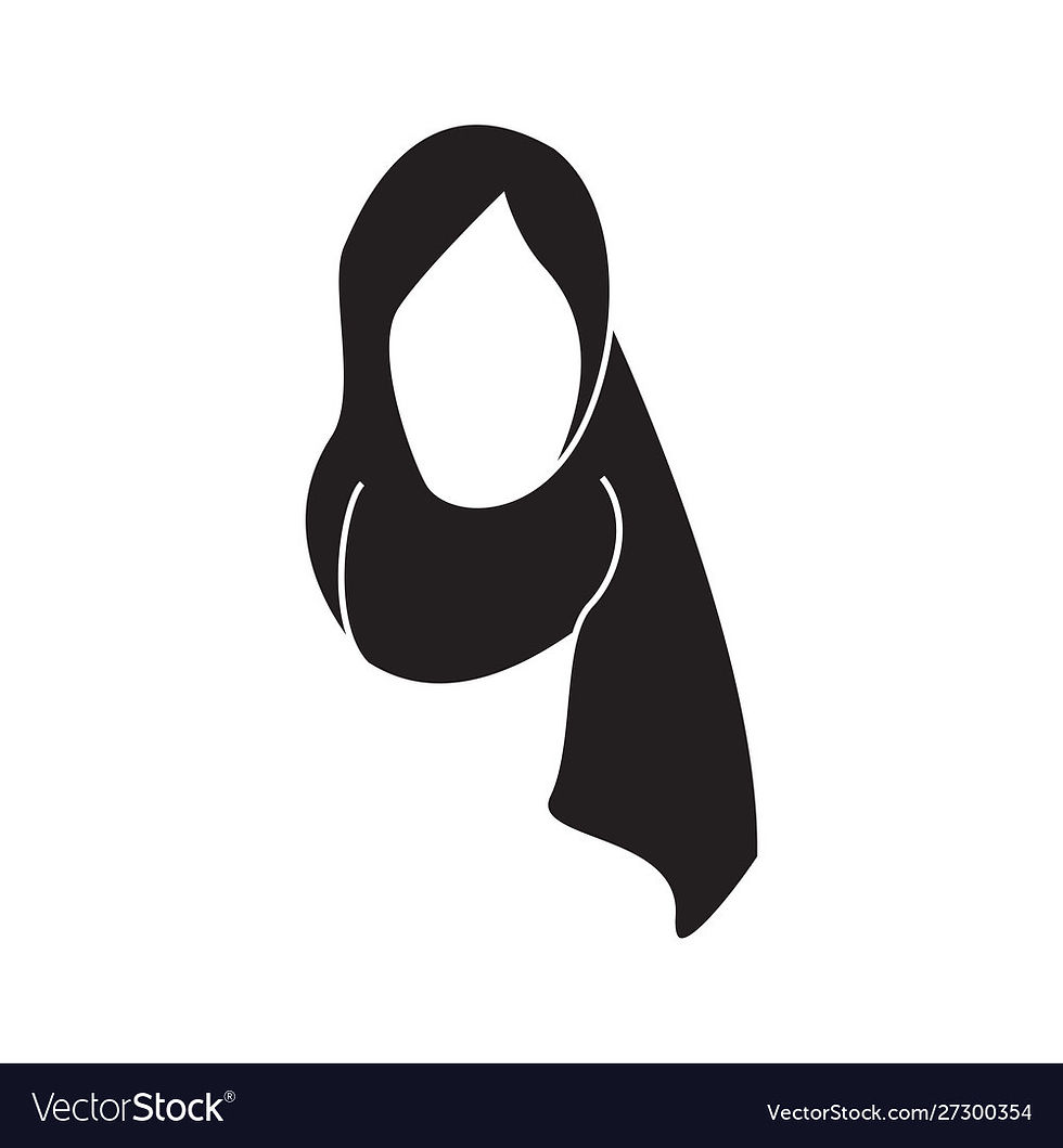
This image really stuck out to me when I was looking at it because of the way the illustrator used white space to their advantage. I think this graphic is a really good example of a way white space can be used well. I think it really pops out to the viewer the image of the hijab and it makes the viewer wonder what the image symbolizes. The white space of this image also makes the hijab easily seen and lets the viewer know that it is the most important part of the image.

When I first saw this design what stood out to me the most was the hands and how they showed different races. I believe this uses the principle of proportion really well. The design shows that the hands are much bigger than the actual words. The size of the fists shows the viewer what is most important to view first. In the case of this graphic, the message that the fists together say is more important than the actual words on the poster.

Comments